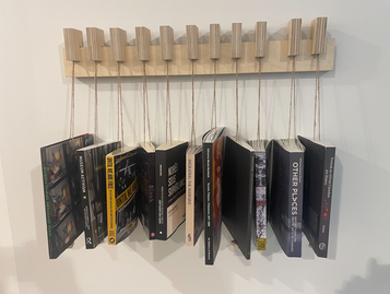
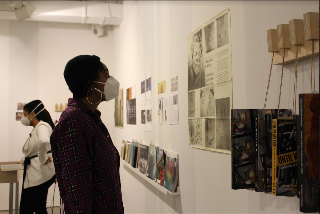
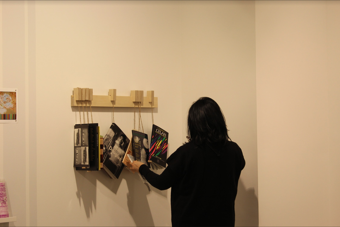
  Date: 2022-08-29 Author(s): Karina Roman Editor(s):Nicholas Raffoul, Koby Rogers Hall, Aman Sandhu Back in the exhibition space of Blackity at Artetext we found ourselves surrounded by posters, publications of all sorts, and books, either hanging from customized wall holders or on display tables in the middle of the room. These records on Canadian Black artists and activists were organized chronologically, but somehow their placement evoked circularity, since arriving to the “end” of the timeline meant lopping back to its beginning in a physical way. This set up of an archive provides another type of reception of the content, conjointly with the subtle lines painted on the wall – the thickness of each of them representing the amount of records found on a certain period of time, a bar chart that helps the visitor to visualize the quantities of the data throughout time, a kind of codification integrated into the walls of Blackity. This curatorial choice left me wondering: what can this type of data visualization communicate when shown outside conventional modes of display (such as paper documents or screens), specially when it builds the space housing that very information? This question speaks directly to ABLM researchers, as research curation is among our tasks and is part of this project’s process. Dr. Joana Joachim’s Blackity in this sense does not only represent a great source for our research, but a great example of research curation (outside of the digital) that renders the information not only visible, but accessible through more creative ways of sharing this archive. Employing haptic qualities and playfulness through inviting design that engages more than one sense. This added to its virtual iteration which you can visit anytime through this link: Blackity [en-ligne]. What type of curation would fit the diverse date gathered by the ABLM team? Sometimes it can be overwhelming encountering all this information at once. And we must be honest, there is a cumulative aspect of research that makes it seem static at times. As if by reading tons of sources, collecting names on charts, and tagging all through categories, we are just hoarding information, feeding databases. This phase of the research often oscillates between a feeling of density when accumulating info, or excitement/stimulation when encountering new ideas, theories, or anything that brings life to the project. But either the case or the mood what must never be forgotten is that for this research data is people. It is easy to forget about what lies behind numbers or databases, so it must become an exercise to remember this, since they represent an activist, artist and/or community member. How we decide to activate this info should honour this human dimension. Now I will rephrase my previous questions: What types of visualization (or other senses engagements) would be appropriate to organize and share the information and data organized by our research? What kind of tool can be used for mindful research curating in order to make this available and accessible for Black folks that could benefit from this research, and to you? Those are a few questions I pose, as I pass the torch to the new team members to come. Best, Karina R.J.
0 Comments
Leave a Reply. |
AuthorArchives
December 2022
Categories |
 RSS Feed
Concordia University is located on unceded Indigenous lands. The Kanien’kehá:ka Nation is recognized as the custodians of the lands and waters on which we gather today. Tiohtiá:ke/Montreal is historically known as a gathering place for many First Nations. Today, it is home to a diverse population of Indigenous and other peoples. We respect the continued connections with the past, present and future in our ongoing relationships with Indigenous and other peoples within the Montreal community.
For more information, please visit: https://www.concordia.ca/about/indigenous/territorial-acknowledgement.html
Credits: EAHR's logo was created and designed by Adrienne Johnson, co-founder of EAHR / notre logo a été créé par Adrienne Johnson, co-fondatrice de EAHR.
Copyright © 2018